
Vertical rhythm and spacing in Vanilla Framework 2.0

Lyubomir Popov
on 15 March 2019
Tags: typography , Vanilla , vanilla framework
Vanilla, the CSS framework behind Canonical’s suite of products and services, has undergone significant changes over the last 12 months. We’ve introduced vertical rhythm, a new type scale, consistent white space in and between elements, and adjustable information density.
We’ll explore each of the above in separate blog posts, but before that, an overview of what’s new as we approach the release of version 2.0:
Vertical rhythm
Simply put, vertical rhythm is about sizing things using a small number of chosen values, each of which is an exact multiple of a base unit size.
In our case, the base unit size is 0.5rem. Everything – from the distance between text baselines to all element heights to all white space between elements – is now a multiple of this base unit. In other words, everything is aligned to a baseline grid.
Besides the initial benefit of things lining up nicely, using a system like this can significantly simplify complex problems. More on this in the section on adjustable information density.
Type scale
Issues with the legacy type scale
Previously, Vanilla used a manually selected subset of traditional point-sizes: 14, 16, 20, 24, 28, 36, 48. While there’s nothing inherently wrong with these numbers, the uneven distribution over the range (14 – 48) was problematic.
Consistency
Having 4 headings so close together at the beginning of the scale meant that they are hard to tell apart. This lead to inconsistent use. For example, h4 and h3 were often used interchangeably, like in these two instances of the Vanilla divider pattern taken from different pages of ubuntu.com:
With an h3 heading:
With an h4 heading:
Scaleability
If you wanted to add a new font-size to this scale, how do you decide what follows after 48, or what comes before 14? The answer would likely depend on the person you ask, and you might be tempted to make ad hoc decisions that happen to work for an isolated problem.
The new type scale
To remedy issues like these, we derived the new font-sizes using a geometric progression (a sequence of numbers where each equals the previous, multiplied by a ratio, as in b*r1, b*r2, b* r3, …, b*rn).
Using a ratio of (16/14), we get:
The red dots represent all possible font-sizes that belong to the progression within the range of the legacy scale (14 – 48). This gives us an even rate of increase, but we still don’t have enough contrast between consecutive sizes, and there are far too many of them.
Indeed, that level of granularity is only useful at the beginning of the scale, so we can obtain 14 and 16. After that, we skip the odd ones and only keep the even ones. This results in an evenly increasing scale, with good contrast and a logical way to extend it in either direction if needed:
(In the graph above, p, h6 and h5 are stacked at the same font-size – 16px, because they only differ in styling – regular/italic/bold.)
The choice of ratio
We chose 16/14 (1.1428) for the following reasons:
- We wanted to keep both 14 and 16 on the new scale
- We wanted to match the overall range of the scale, so p is still 16, and h1 is just shy of its previous size of 48
- We wanted to provide enough contrast between heading sizes so they’re not easily confused, but we didn’t want to upset text-wrapping in existing content too much. This is because content writers often tailor copy so lines break nicely within the existing design, and we wanted to respect that as much as possible.
Units
Although I’ve been referring to pixel values, the actual font-sizes are defined in rems. To be able to show the intervals between them as dots in the graphs above, I’ve converted them to pixels, assuming 1rem = 16px.
This isn’t always the case, as the value of 1rem can be changed in browser settings. Additionally, we’re currently testing an increase to 1.125rem (from 16px to 18px) on the root element’s font-size after a certain breakpoint, which effectively zooms everything by 1.125. This is to account for the (assumed) larger distance between the eye and a bigger screen.
Consistent white space in and between elements
The baseline grid represents a shift to more rigorous use of white space, but it only lays the groundwork. Our next steps were:
- Audit both horizontal and vertical use of space, both inside (padding) or outside (margins) of elements.
- Identify things that should match, but don’t, and fix them
- Link matching values, and unlink values that happen to coincide, but have no relation to each other. This makes it safer to change settings, as the effect of the change is much more predictable.
- Finally, we adjusted the spacing of headings to improve the reading experience
This resulted in hundreds of tiny adjustments touching every single Vanilla element. To give an idea of the overall effect here’s a before / after comparison of a small subset of elements. Notice how the height of the accordion rows on the left is close, but not exactly equal to the height of the table rows in the before example:
Before:
After:
Adjustable information density
We have two different use cases for Vanilla. On one hand, it needs to provide a comfortable reading experience on sites like ubuntu.com and snapcraft.io, using plenty of white space.
On the other hand, some apps built using the framework need to be able to fit as much information as possible on a 1300x800px laptop, a very common screen size for customers of our server provisioning app MAAS.
To achieve this, we needed an easy way to control information density at build time. This meant going through every element, and deciding how much to inflate/deflate its padding and margins.
Since everything is aligned to a baseline grid, this was much less of a chore than it sounds. All we needed to do was start with the densest version, and decide how many multiples of the base unit to add to each element.
For instance, margin-bottom of elements like buttons, pre, inputs etc is defined as a sum of two values: the minimum amount used in the densest setting, plus a flexible part which can be increased/decreased by a global multiplier:
$spv-outer–scaleable: $sp-unit * (1 + $multiplier);
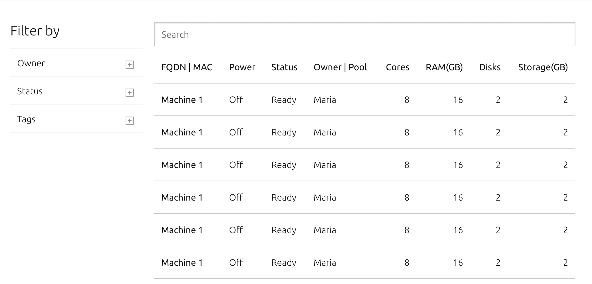
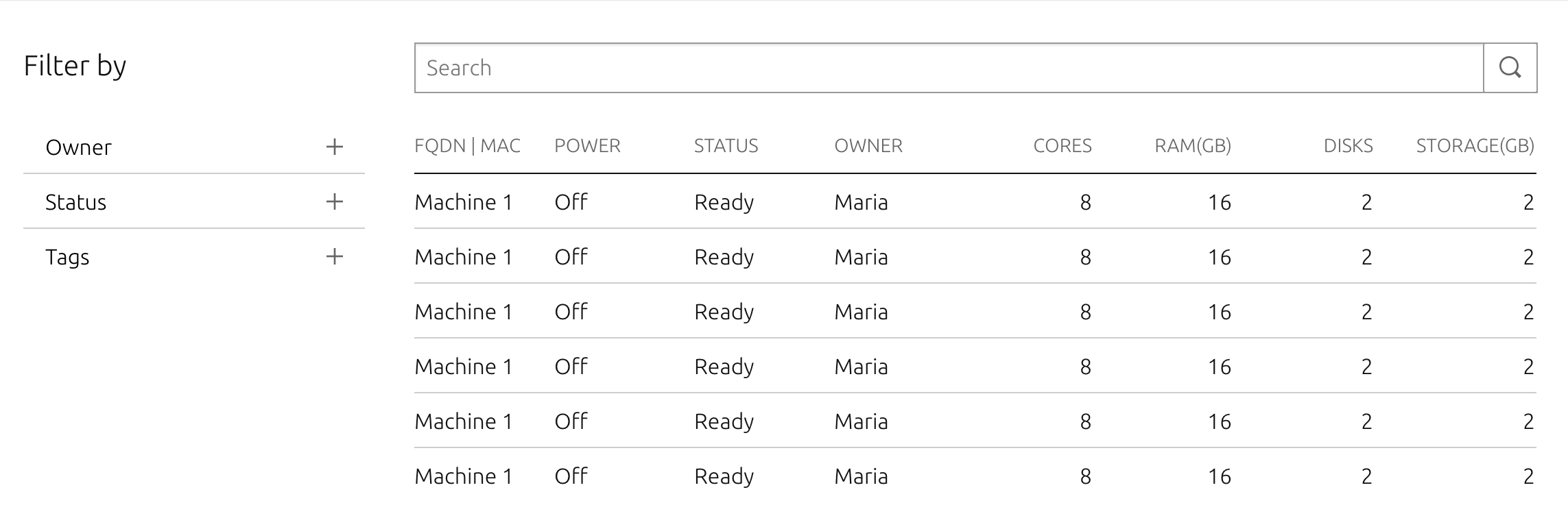
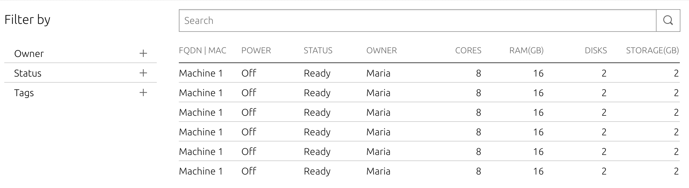
For MAAS, that multiplier is 1, so the above calculation results in a margin-bottom of 1rem. For ubuntu.com, the multiplier is 2, which produces 1.5rem.
Multiplier set to 1:
Multiplier at default of 2:

Multiplier set to 3:

Summary
I hope this overview has given a bit of insight into how spacing and typography work in Vanilla 2.0. We’re still adding the finishing touches, and will follow up with a few more detailed posts once we’re closer to the 2.0 release date.
Ubuntu cloud
Ubuntu offers all the training, software infrastructure, tools, services and support you need for your public and private clouds.
Newsletter signup
Related posts
Vanilla 4.0 release
Last week we released a new major version of the Vanilla framework. Vanilla 4.0 introduces the elements of the new style used for a current rebranding of...
How we implemented an interactive Live Demo Box
The Vanilla squad recently spent a two week sprint prototyping an interactive live demo box. We were tasked with coming up with a proof of concept, to enable...
Release of Vanilla framework v3.0
We’ve just released Vanilla v3.0 – a new major update to our CSS framework. It includes a few significant updates and improvements around spacing variables,...